
Learning from Toronto pt.2 | Data visualization

This graduate thesis research is focused on how urban data visualization can be used to investigate the relationship between people’s perception of concrete phenomena happening in cities, and actual data about them. I chose to explore these issues by focusing on Toronto, where I live, specifically addressing the housing topic—one of the most urgent challenges the city is currently facing.
I developed a prototype for a mobile-first app (see it on the project’s part 1 page) based on an interactive survey in which citizens are asked to visually provide their guess about urban issues, before being presented with visualizations of the actual data on the same topics. I then designed, developed and programmed one interactive visualization for each of the sub-topics addressed in the survey questions.
Check them out below (with live interaction)
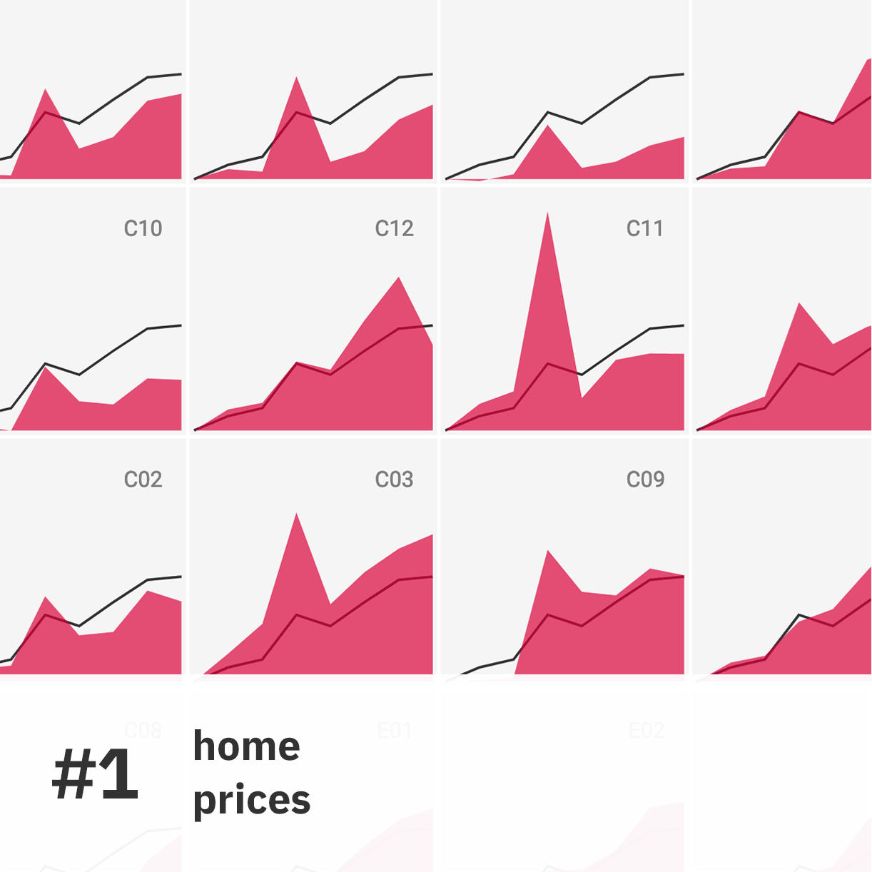
Viz #1
Change in Toronto Home Prices 2011-2018
This interactive visualization addresses the topic of the first question in the LFT survey. An area chart depicts the relative change in median home prices for each of the 35 areas used by the Toronto Real Estate Board to subdivide the city. The vertical dimension in the area charts encodes relative change in prices over the previous year. The charts are arranged in a cartogram based on Toronto’s topography.
Visual model: area chart, cartogram
Sources: Toronto Real Estate Board—Market Watch Archive


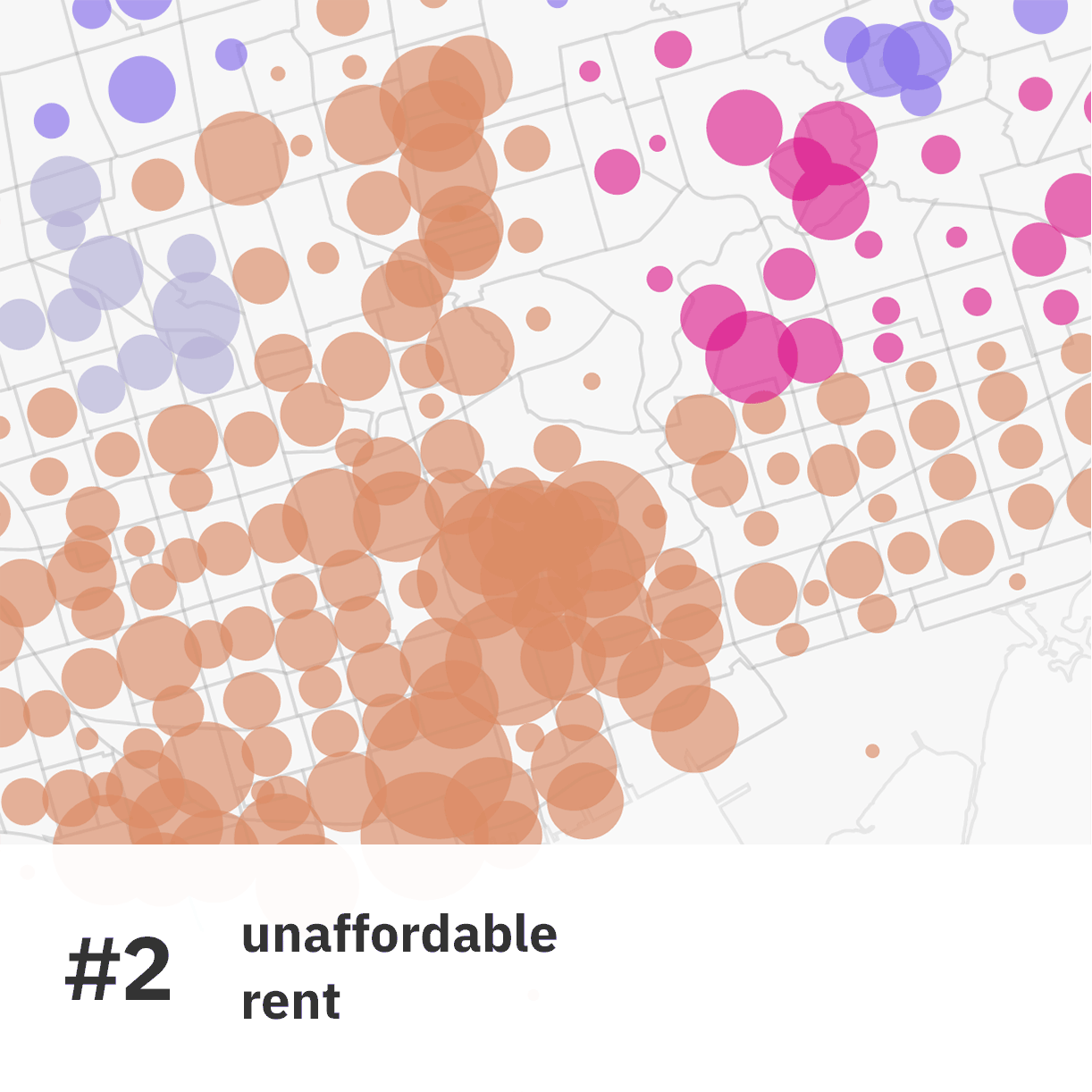
Viz #2
Unaffordable Rent in Toronto
This visualization follows up on Question 2 from the interactive survey, depicting the amount of renter households who are spending more than 30% of their total income on shelter costs(the official threshold by which Statistics Canada defines ‘unaffordable housing’). Each census tract is represented through a circle whose area is proportional to the data. Circles are color-coded based on the main districts in the city. You can zoom in the map, hover on visual elements to access more information, and use the interactive features in the left panel to filter the data.
Visual model: map, bubble plot
Sources: Toronto Open Data Portal—Neighbourhood Profiles


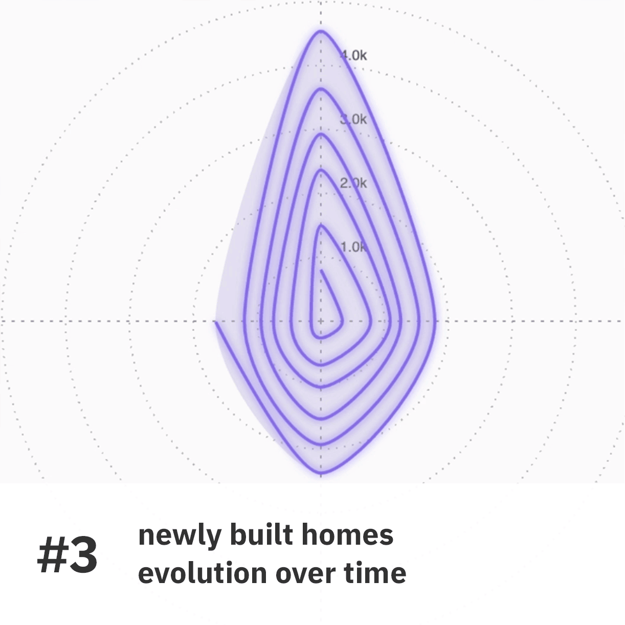
Viz #3
Distribution of new homes in Toronto
This viz builds on the circular layout of the donut chart in Question 3, in which the districts are arranged around the circle according to their true position in the city, to generate a “compass” visualization that allows you to observe recent trends in housing data from a high-level spatial perspective. The charts have two layers: they grey areas follow the principles of radar charts and portray the most recent data; the spirals are animated radial line charts that depict the evolution of each value, from 2012 to the most recent data available. You can visualize datasets about newly completed homes but also on home prices and rent, two related topics already addressed in the first two questions.
Visual model: radar chart, radial line chart (basic structure based on Nadieh Bremer’s radar chart)
Sources: Toronto Real Estate Board – Market Watch Archive; Canada Mortgage and Housing Corporation – Housing Completions: By Dwelling Type


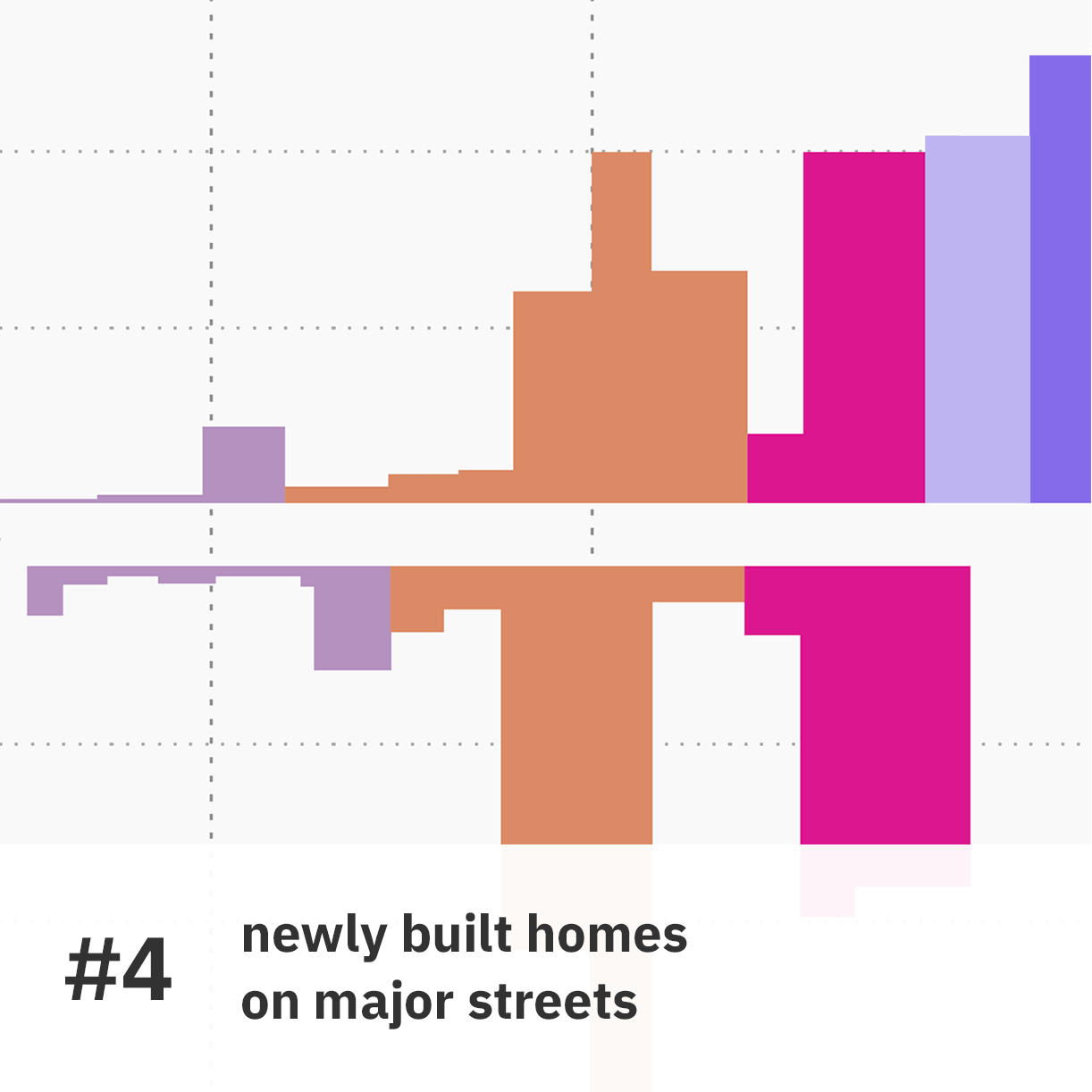
Viz #4
New Homes in Toronto. A Look at Major Urban Streets
This interface allows you to explore data about newly completed residential units through “sections” of four major urban streets that cross Toronto’s urban territory: Queen st, Eglinton Ave, Yonge St, Dufferin St. Data for dwelling types, in each census tract on either side of the streets, is visualized as a rectangle: its width is proportional to the extension of the corresponding census tract on the street, while its vertical dimension encodes the number of dwellings. Annotations and a reference map provide contextual information to help readers orient themselves in the visualization. You can filter the data to focus on a specific dwelling type.
Visual model: custom/variable width barchart
Sources: Canada Mortgage and Housing Corporation—Housing Completions: By Dwelling Type


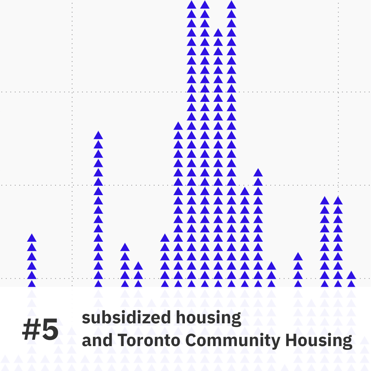
Viz #5
TCH’s housing stock: a timeline
This visualization is connected to Question 5, in which you were asked to give your guess about the average time households have to wait before being granted a subsidized home in Toronto. Here you can take a closer look at the Toronto Community Housing Corporation through two timelines. In the first one, a unit chart visualizes the Corporation’s housing stock. Each triangle represents 100 RGI residential units, arranged by year of construction.
In the second visualization, the blue area chart depicts the evolution of the total amount of subsidized units in TCHC’s stock since 1950, while the red line represents the increase in the number of households with an active application on the Centralized Waitlist for subsidized housing, which peaked in 2018 at 100,515.


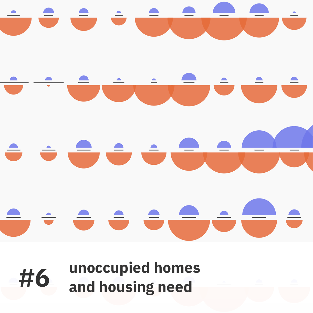
Viz #6
Unoccupied homes, households in need
Connected to the topic addressed in Question 6, this application uses a grid of small multiples to depict the number of homes classified as not permanently occupied (blue) and the number of households in ‘core housing need’ (orange) in each of the 140 neighbourhoods in Toronto. The values are encoded by the areas of two semicircles. The length of the black line dividing them represents the median home price for each neighbourhood. You can filter the data based on district, look for your neighbourhood, and sort the grid based on the three portrayed values, or on location.
Visual model: small multiples, proportional area chart
Sources: Toronto Open Data Portal—Neighbourhood Profiles
Learning from Toronto (part 2 – visualizations)
Year: 2019
Project type: academic – Graduate Thesis project, York University, Toronto.
Supervisory committee: Angela Norwood, Michael Friendly
Specs: series of interactive, browser-based visualizations developed using HTML, CSS, Javascript, d3.js, QGIS
Data: Toronto Open Data Catalogue – Neighbourhood Profiles, TCH Data; Toronto Real Estate Board – Market Watch Archive; Canada Mortgage and Housing Corporation – Housing Completions: By Dwelling Type; Toronto Community Housing – Annual Reports