
Learning from Toronto pt.1 |Data visualization, UX+UI design

This graduate thesis research was focused on how urban data visualization can be used to investigate the relationship between people’s perception of concrete phenomena happening in cities, and data collected about them. I chose to explore these issues by focusing on Toronto, where I live, specifically addressing the housing topic—one of the most urgent challenges the city is currently facing.
I proposed a prototype for a mobile-first app based on an interactive survey. Within the app, citizens are asked to visually provide their guess about urban issues, before being presented with visualizations of the actual data on the same topics, and of answers from other people, within the same visual models.
I then designed, developed and programmed one interactive visualization for each of the sub-topics addressed in the survey questions, which you can see in the project’s part 2 page.

“What is the safest neighbourhood in the city?”, or “How are rent prices changing in the area where I live?” Most people living in urban environments have probably asked themselves common questions like these at some point in their life as citizens.
A usual way to find answers to these questions would be to look at publicly available urban data. But of course, every citizen would also be able to answer those questions according to their unique, personal experience of urban life.
So what if their own answers to this kind of questions, portraying their perception of urban issues, could be recorded, analyzed and shared to foster a dialogue between people, institutions and the whole urban community?
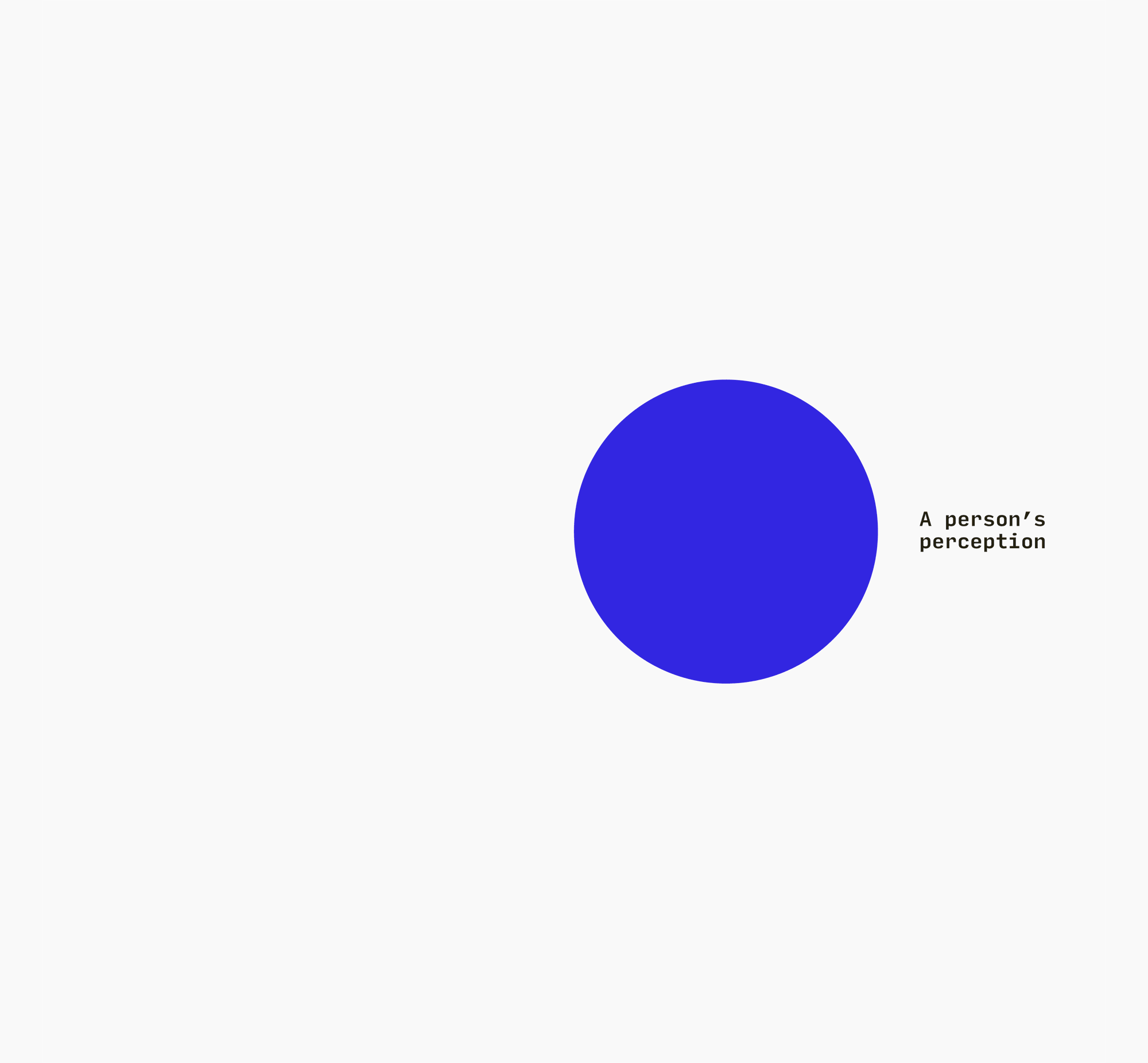
This thesis project explores how (urban) data visualization can be used to investigate the gap between people’s perception of concrete phenomena and actual data about them.
Research on cognitive bias suggests that visually revealing such a gap can help in generating a deeper and more engaging understanding of information. I decided to investigate how this practice could be used to better inform citizens, raise awareness on urgent urban issues, and possibly challenge widespread misconceptions within urban communities.
I also wanted to research how recording and analyzing the gap between what citizens think and what data says can help public institutions to better inform their decisions, and to uncover problems and opportunities that might not necessarily be evident by merely analyzing the data at their disposal.
How? By asking questions to citizens! I took inspiration from the methodology in NYT’s groundbreaking series You Draw It to design an interactive survey in which citizens are asked to manipulate visualizations in order to answer a series of questions about urban issues. Only after having shared their personal guess, users are presented with visualizations of data on the same topics (sourced from publicly available datasets), and of answers from other users, within the same visual model.

The interactive survey: an example of one question/answer/visual comparison cycle
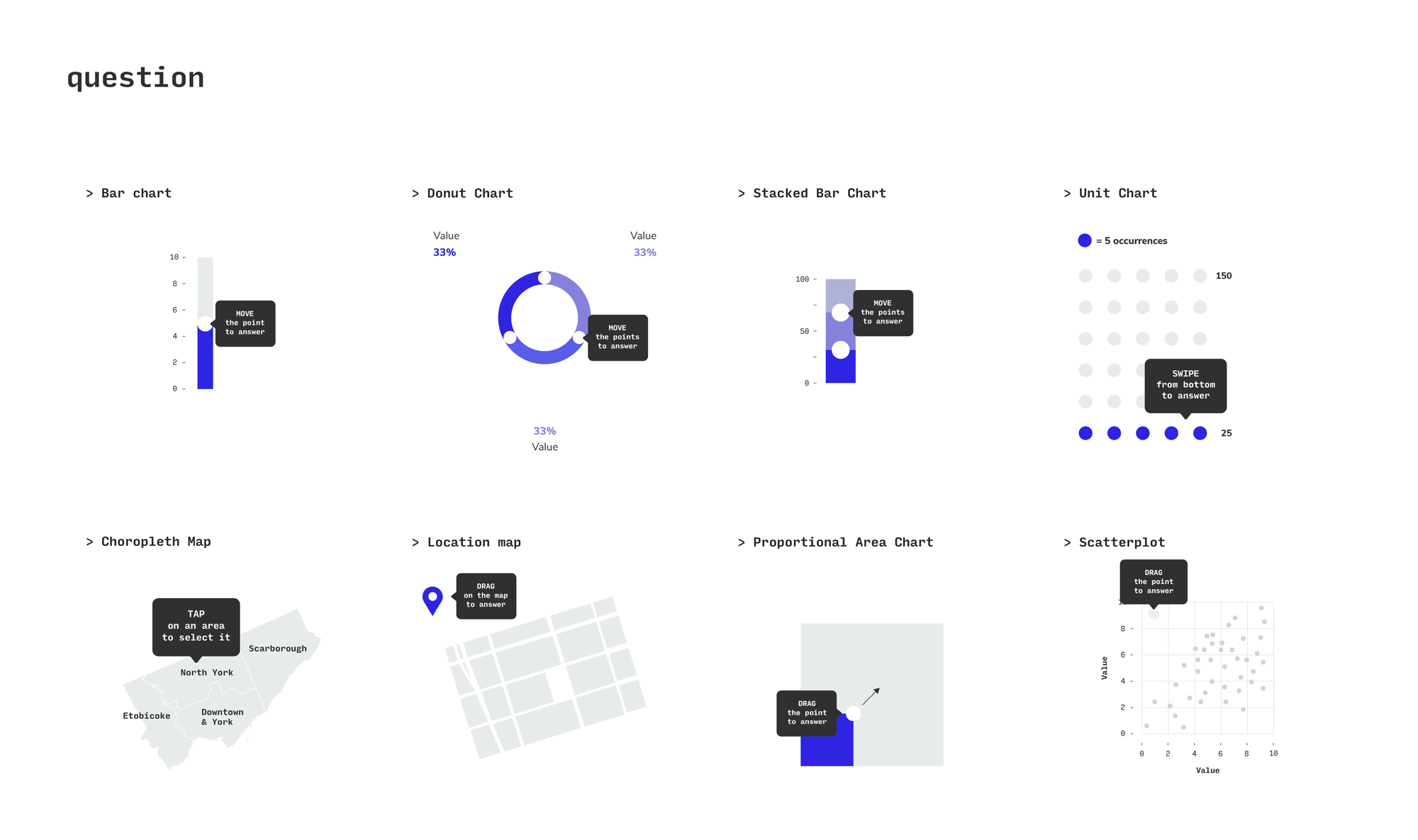

After a first research and design phase, in which I investigated the application of this methodology to different visual models and different kinds of questions (image above), I developed a working prototype of the mobile application which I used to conduct user testing with citizens from the Toronto Metropolitan Area. These one-on-one sessions were designed to gather a variety of feedback about the project, and were carried out as a mix of interviews and hands-on testing of the prototype. The contribution from participants was invaluable to improve every aspect of the project, from the wording and scope of questions, to the visualization methods.

Complete structure/user-flow of the app and the interactive survey, both revised based on feedback gathered during the user testing sessions.
In order to allow an in-depth, more detailed exploration of the issues addressed in the interactive survey, a further step in the application user-flow allows people to access more complex, interactive visualizations (which I designed, programmed and developed) related to the questions they just answered.
Check them out in the project’s part 2 page
Learning from Toronto (part 1 – mobile app)
Year: 2019
Project type: academic – Graduate Thesis project, York University, Toronto.
Supervisory committee: Angela Norwood, Michael Friendly
Specs: research, design, prototyping and testing of a mobile-based application for a visual interactive survey.
Data: Toronto Open Data Catalogue – Neighbourhood Profiles, TCH Data; Toronto Real Estate Board – Market Watch Archive; Canada Mortgage and Housing Corporation – Housing Completions: By Dwelling Type; Toronto Community Housing – Annual Reports